Anthropic Just Rewrote Their frontend-design Skill — and Named 3 AI Design Clichés (With Hex Codes)
Anthropic quietly rewrote their frontend-design skill on June 18 in commit 423563cf. The new version contradicts the old one on its central thesis, and names three specific AI-generated design clichés in the public plugin documentation. With hex codes.
The SKILL.md file diff is +39 / -26 lines (commit-wide it’s +41/-28; the rest is a marketplace.json bump and the plugin version going to 1.1.0). On paper, a maintenance bump. In reality, a philosophy reversal.
I noticed this while reviewing my own image-generation skills last week against the upstream anthropics/claude-code version of the file. It seems to have slid in under the radar, which is a shame because it’s one of the more interesting design-engineering shifts Anthropic has shipped recently. Here’s what changed and why it matters if you ship UI that touches a model.
The old version told the model to be bold
The old skill’s central instruction was extreme. From the file Anthropic had been shipping until June 18:
Pick an extreme: brutally minimal, maximalist chaos, retro-futuristic, organic/natural, luxury/refined, playful/toy-like, editorial/magazine, brutalist/raw, art deco/geometric, soft/pastel, industrial/utilitarian, etc.
And closed with:
Don’t hold back, show what can truly be created when thinking outside the box and committing fully to a distinctive vision.
The structure of the old document was a list of axes to push: Typography, Color, Motion, Spatial Composition, Backgrounds. Each axis got its own “be distinctive here” paragraph. The implicit instruction was: maximize boldness across every axis simultaneously.
It reads like a pep talk. Imagine running it on every UI generation in your product. Now imagine the output.
The new version tells the model to be restrained
The new skill opens with a completely different frame:
Approach this as the design lead at a small studio known for giving every client a visual identity that could not be mistaken for anyone else’s. This client has already rejected proposals that felt templated, and is paying for a distinctive point of view: make deliberate, opinionated choices about palette, typography, and layout that are specific to this brief, and take one real aesthetic risk you can justify.
Note the word one. The new file uses it again later, more directly:
Spend your boldness in one place. Let the signature element be the one memorable thing, keep everything around it quiet and disciplined.
And then closes the restraint section with an aphorism widely attributed to Coco Chanel:
Consider Chanel’s advice: before leaving the house, take a look in the mirror and remove one accessory.
The reversal is precise. Old: pick an extreme on every axis. New: pick one signature, keep the rest quiet, then remove one more thing before you ship.
If you read both versions back to back, the old one reads (to me) like it was written for the demo. The new one reads like it was written by someone who has now sat with a year’s worth of “be bold everywhere” outputs and noticed they all converged. I have no insider information on intent — this is just how the two documents land if you read them in sequence.
They named the three defaults. With hex codes.
This is the part I did not expect.
The new file contains this paragraph:
AI-generated design right now clusters around three looks: (1) a warm cream background (near #F4F1EA) with a high-contrast serif display and a terracotta accent; (2) a near-black background with a single bright acid-green or vermilion accent; (3) a broadsheet-style layout with hairline rules, zero border-radius, and dense newspaper-like columns.
To translate: Anthropic is publicly stating, in their own plugin docs, the hex value of the cream background their model defaults to. They followed it with this carefully worded line:
All three are legitimate for some briefs, but they are defaults rather than choices, and they appear regardless of subject.
That sentence is doing real work: it isn’t saying “these are bad designs.” My read is closer to “these are what we ship when no one is steering us.” Either way, the team is auditing their own output and writing the audit into the public docs.
This is essentially the visual-design equivalent of the AI Slop word lists that text-side teams have been maintaining for a year. To make the parallel concrete, here is what the three defaults look like rendered as actual product hero sections. Same fictional product (an audit tool called Lumen, naturally), three default treatments.
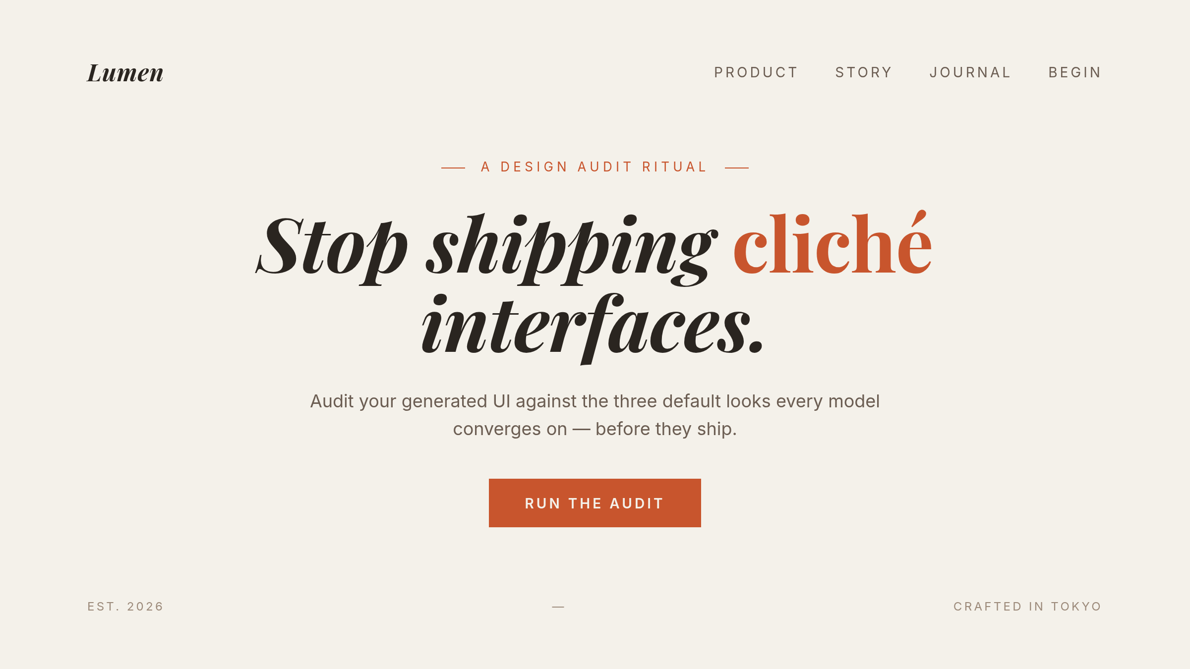 Cliché 1:
 #F4F1EA cream, a Playfair-style italic serif, terracotta accent. Reads “editorial sophistication” at a glance, reads “every AI-generated landing page I’ve seen this quarter” two seconds later.
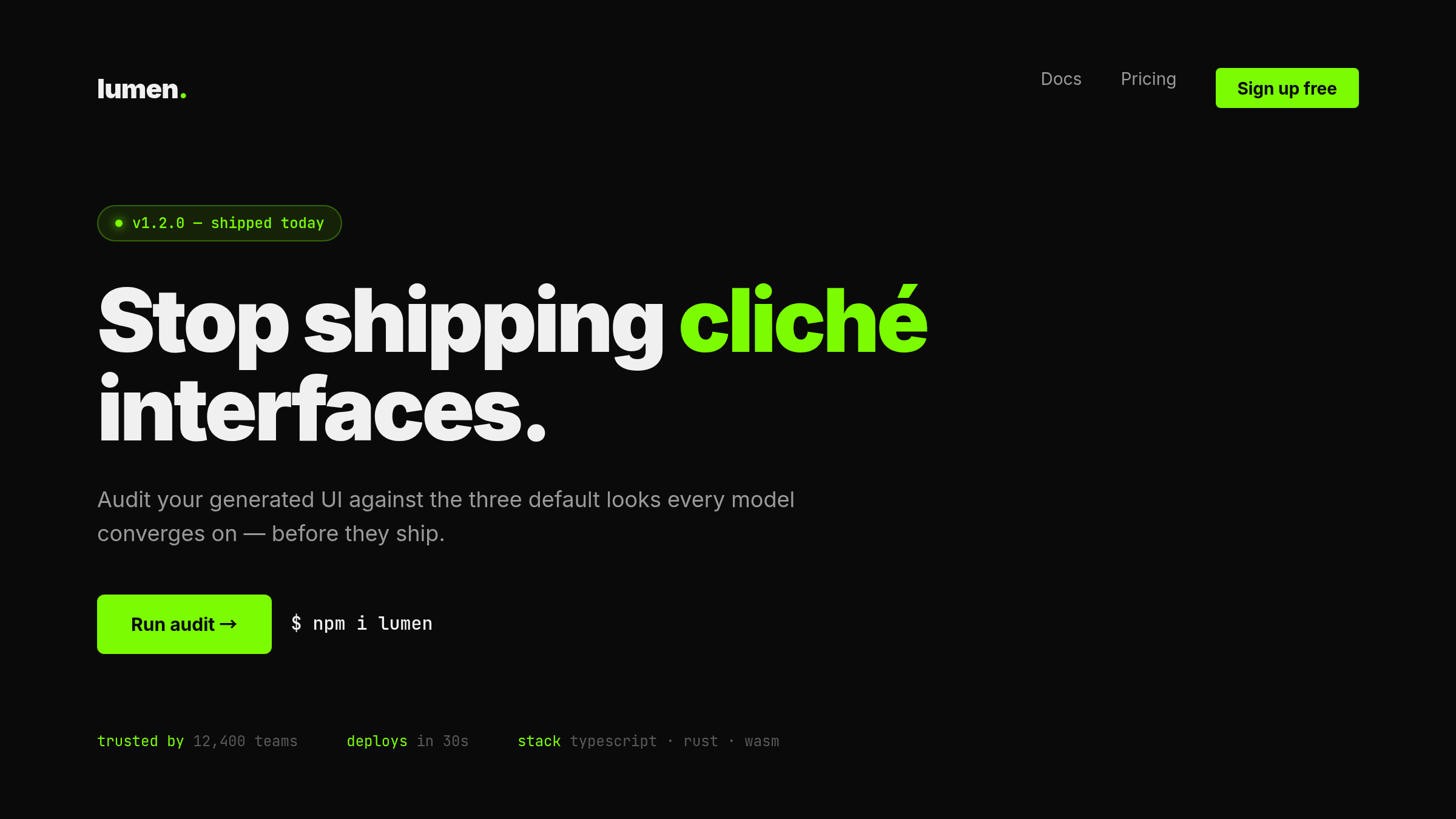 Cliché 2: near-black background, single bright accent, monospace details, “trusted by” strip. First impression: “edgy modern tech.” Closer look: indistinguishable from the last three YC Demo Day landing pages you visited.
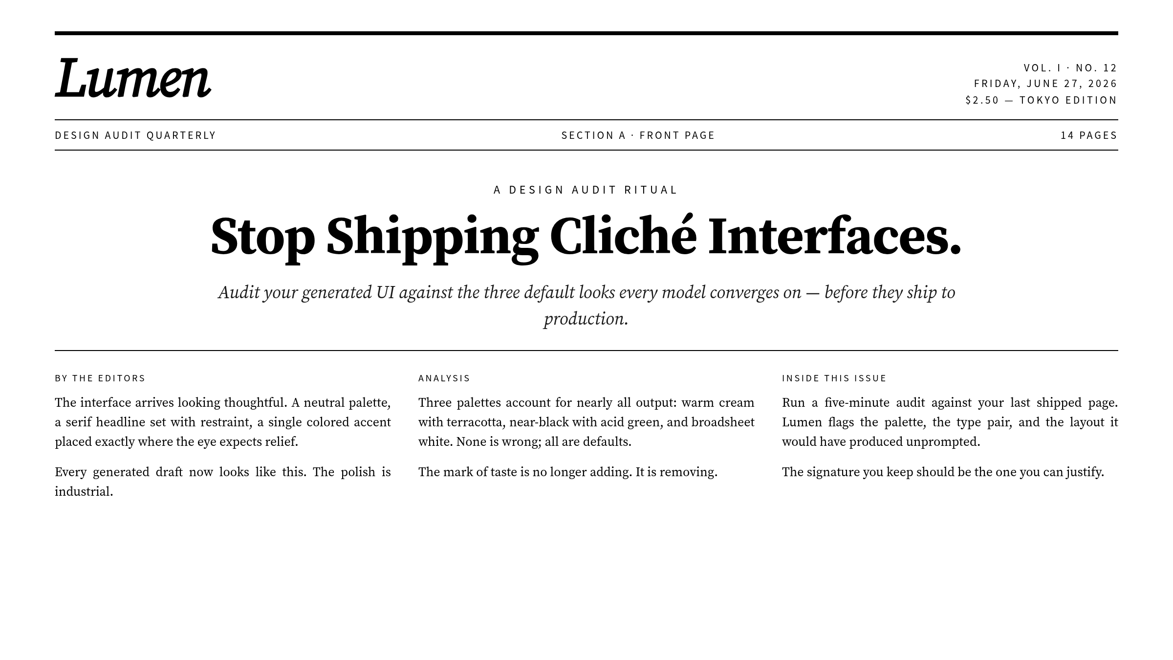 Cliché 3: broadsheet style, hairline rules, zero border-radius, dense columns. Signals “serious and intellectual,” then immediately falls back into the AI startup “About” page genre.
None of these are bad. They are all competent, defensible, ship-ready. They are also default behavior, which means they read as templated regardless of what the underlying product actually does.
The process got replaced with a loop
The other major structural change is in how the skill instructs the model to work. The old version had a list of axes. The new version has a process.
Process: brainstorm, explore, plan, critique, build, critique againThe expanded instructions describe a five-step loop:
- Read the brief. If it’s vague, pin a subject, audience, and the single job the page must do.
- Build a compact token system: 4-6 hex values, 2+ type roles, a layout described in prose + ASCII wireframe, and a signature element.
- Critique the plan against the brief. Anywhere it reads like “the generic default you would produce for any similar page,” rewrite it and say what changed.
- Build it.
- Take a screenshot and critique your own output.
This is, structurally, code review applied to design. Plan → diff against the spec → implement → self-review. The skill is essentially asking the model to do its own design critique as a first-class step, with explicit instruction to flag any place where it would have produced the same thing for any other brief.
Whether the model can actually do this self-critique reliably is a separate question. But the intent — “audit your own defaults as part of the work” — is a notable shift from “execute the brief.”
Copy got promoted to design material
The other new section is “More on writing in design.” It did not exist in the old version. The opening line is:
Words appear in a design for one reason: to make it easier to understand, and therefore easier to use. They are design material, not decoration.
The rules are practical. Some I want to lift directly:
- A button says exactly what happens. “Save changes,” not “Submit.”
- The same verb threads through the whole flow. The button labeled “Publish” produces a toast that says “Published.”
- Errors don’t apologize. They state what happened and how to fix it.
- An empty screen is an invitation to act, not a mood.
If you’ve ever fought with a product team about whether UX copy is “the designer’s job” or “the engineer’s job,” Anthropic has just put it on the design skill’s responsibility list.
What restraint actually looks like
Here’s the same Lumen hero, rebuilt with the new skill’s philosophy. Navy monochrome, one signature element: the word “One.” set enormous, taking the entire vertical. Everything else quiet and disciplined.
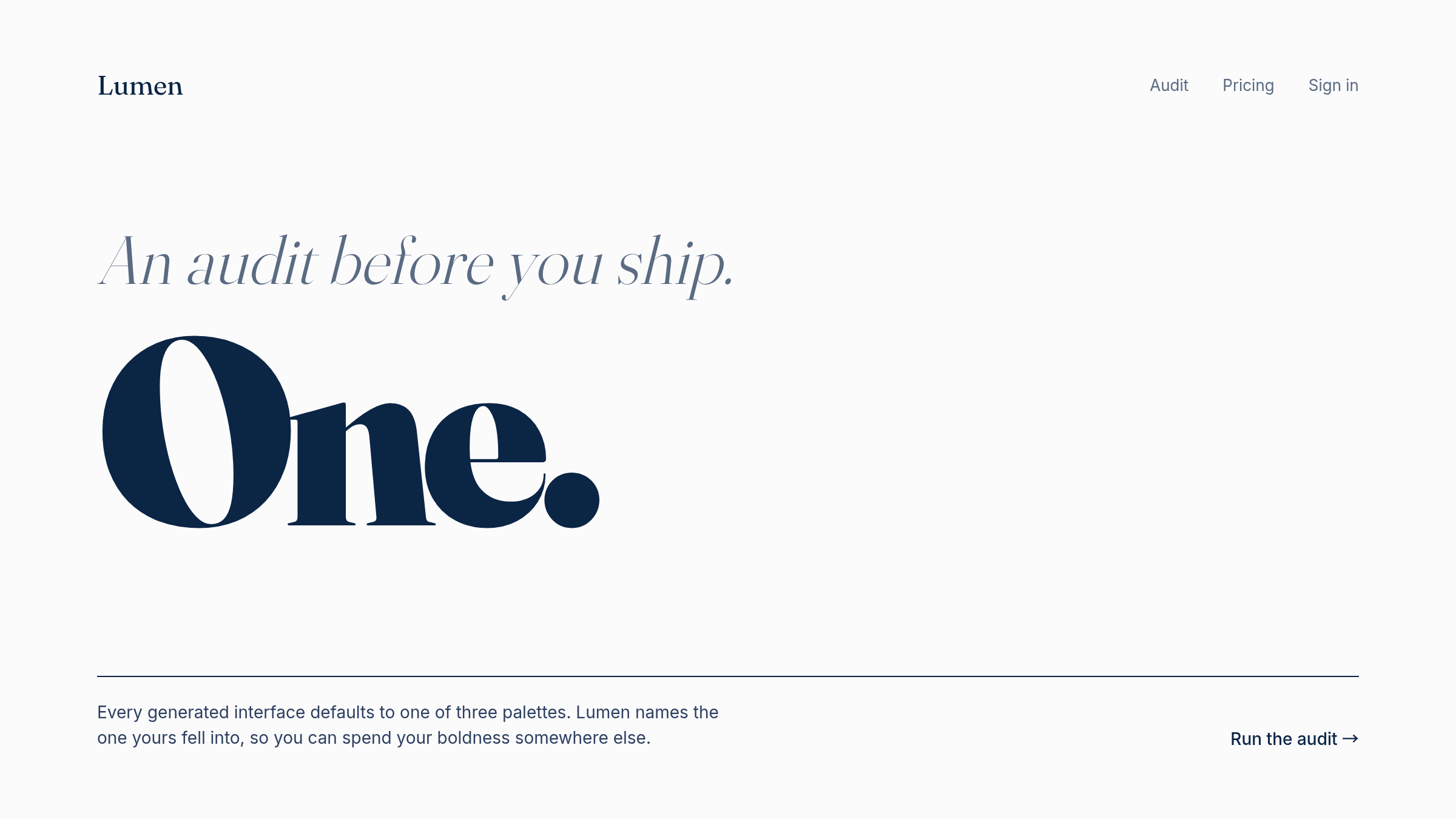 The “after” treatment. Navy text on near-white, the single word “One.” set giant and italic as the only visual moment, navigation and footer deliberately small. Image’s job: prove that “spend boldness in one place” is a real layout choice, not a slogan.
The signature here is a typographic moment, but the recipe generalizes: pick one axis (color, type, layout, motion, decoration) to push hard, then withdraw on every other axis. The trap the old skill set was telling the model to push on every axis at once, which paradoxically forces convergence on the safest combination of attacks. The new skill explicitly diagnoses this in the line “Spend your boldness in one place.”
What this means if you ship UI through a model
A few practical takeaways.
Check your generation prompts and skills against the new version. If your prompt has language like “be bold,” “be distinctive,” “push the design,” you are likely producing one of the three named clichés. The fix is to specify one axis to push and explicitly constrain the rest.
The hex-code audit is borrowable. “If the output background is near #F4F1EA and the accent is terracotta, flag it” is a check you can actually write. The same shape works for the other two clichés (near-black with an acid-green accent, broadsheet hairlines on white) — pick your own threshold values for those, Anthropic only spec’d the cream one to the hex. It’s the visual equivalent of grep-ing for “delve” in LLM output.
Bring copy into the design pipeline. If your design tooling doesn’t include button labels, empty-state text, and error messages as first-class artifacts, you’re shipping a stale split of responsibilities. Anthropic just promoted copy to “design material” in their public docs.
Build a critique step into your generation loop. The “plan, build, critique, build again” pattern is portable. You can wrap any single-shot generation in a self-review pass that explicitly asks “what would you have produced for any similar brief, and how does this differ?”
The summary
If I had to compress the new skill into one sentence: AI-generated design fails by being bold everywhere; the fix is to be bold in exactly one place and remove one accessory before shipping.
My take: Anthropic is auditing the defaults their own model produces and writing the audit into the public plugin docs. That’s a useful thing to read, and an unusually honest move to make where everyone can see it.
The full diff is at commit 423563cf if you want to read it cold. It’s worth ten minutes.
If you can read JP and want the systematic version of this same theme, I have a Zenn Book about it: Why is all AI-generated UI blue? An escape guide from sameness.
References
Was this article helpful?